


I was fascinated by the posters I had seen in Lisbon in few years after their revolution—and the black and white cheap posters for punk and new wave bands as well as the leftist posters plastered up around town. I wrote careful descriptions of certain nondescript sites I knew and painstakingly used sheets of Letraset letters to make cheap posters that I could put up in the site the poster described. I made five of these, but only liked two of them. Those two worked better because they included a scrap of language that was already there in the site itself. “ROCK AGAINST FACISM”—it was probably meant to be “ROCK AGAINST RACISM” but wasn’t well enough written on the railway overpass.
When I was pasting this first one up, one person threatened to call the police—because I was obviously “a Communist.” Another person came walking by and said, “That’s good, that’s good. We need more politics in the street.”
It seemed that it was fine to advertise a band or a yard sale or store that was opening. But why were these deliberately neutral descriptions taken to be political? The poster mentions the nearby factories—they’re all gone now.
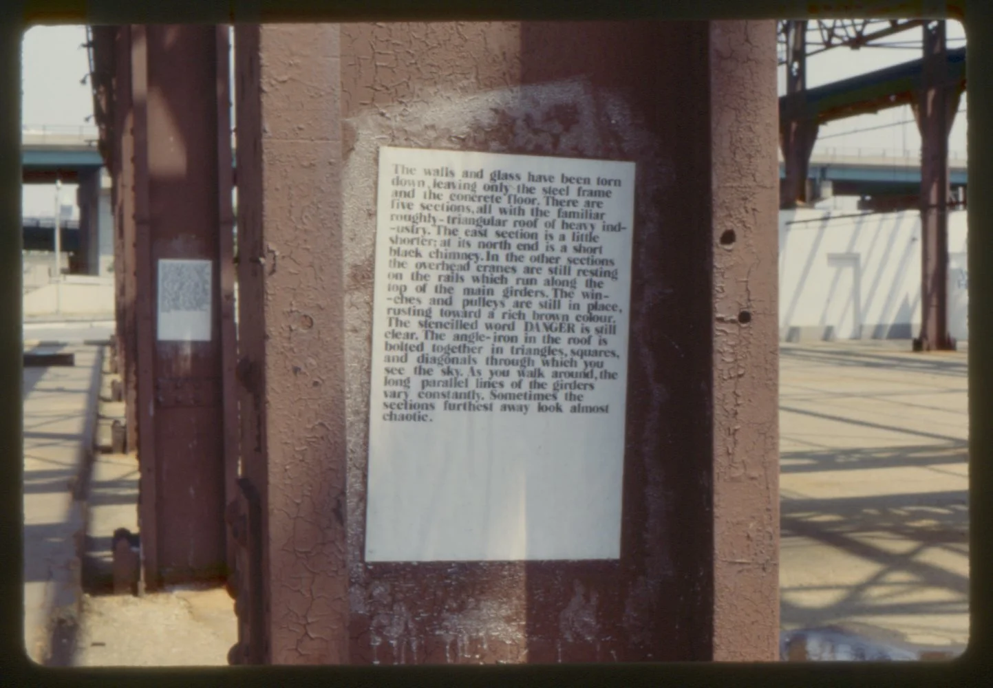
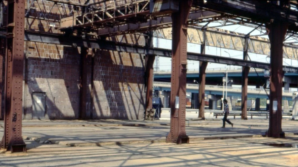


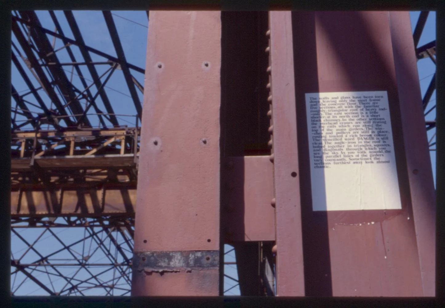
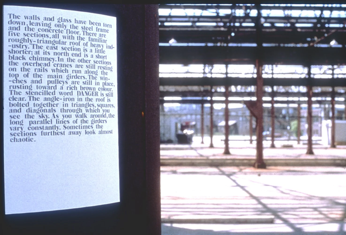
This poster described the abandoned skeleton of an industrial building. It used to exist on the edge of the lake, close to the present-day Harbourfront Centre. The word, “DANGER” had been painted on one of the girders. Industry was vanishing from the city.
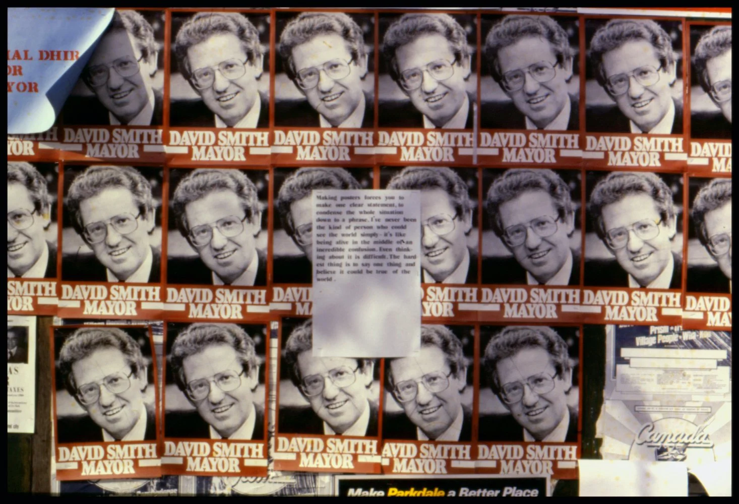
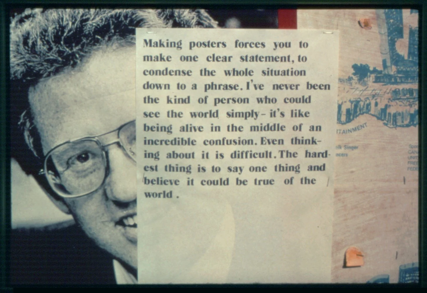


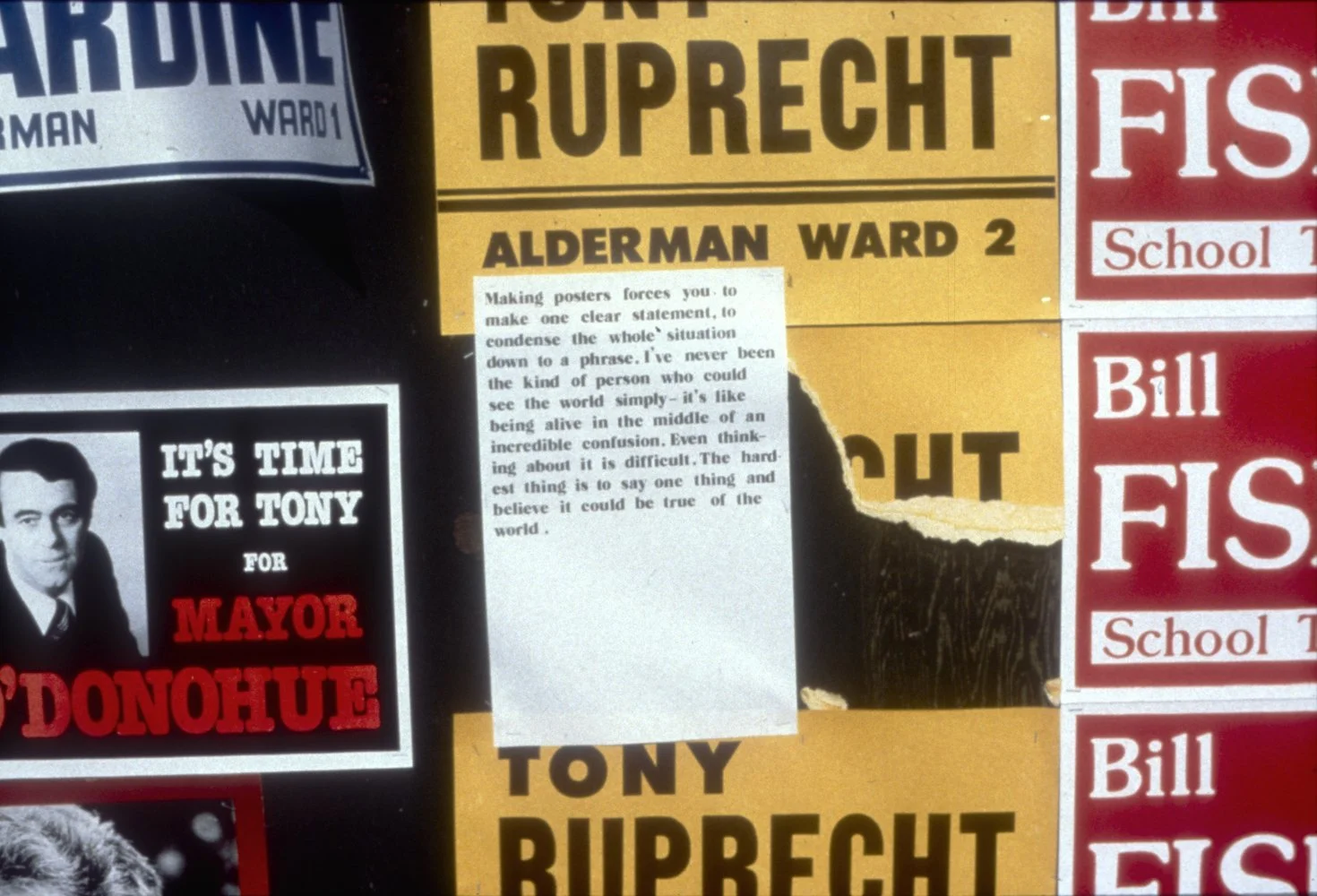
I decided to make a poster that could drop into the context of the posters of Toronto’s municipal election.
It advocated nothing. It simply spoke of my distrust of the way politics reduced things to simple, almost meaningless slogans.


On the first floor of the “Pilkington Glass Palace” (as people called it), Permanent Press did a lot of quick printing for the Toronto art scene as well as posters for bands. Run by Gary Shilling and Paul Collins, they designed books for Rumour Publications, printed up party invitations and flyers, and were generally important to the Mercer Street community “with its ethos of low-key survival based on the principle: more for less” (as Mike Hoolboom recalls things.)
After making the poster/descriptions and the poster in the civic elections, Gary Shilling approached me about doing a poster together. The image he wanted to use was pretty provocative—especially given that Gary was Jewish. It was an image of Hitler with his arm around a very blond, smiling child. I was initially hesitant but went ahead with the project.
The little girl in the poster says, “Politics defines an area where desire can act.” The torn scraps on the right hand side reads, ”its process is not a calculated distortion of history, but a HYSTERICAL outburst.”The poster was printed as though it had already been attacked. “Fuck off” is scratched across Hitler’s shoulder and on the left side, below the torn piece of text, are three tears in its surface.
Gary and I received much criticism for this, notably from Karl Beveridge. As I write this today, I think of Donald Trump’s outbursts.

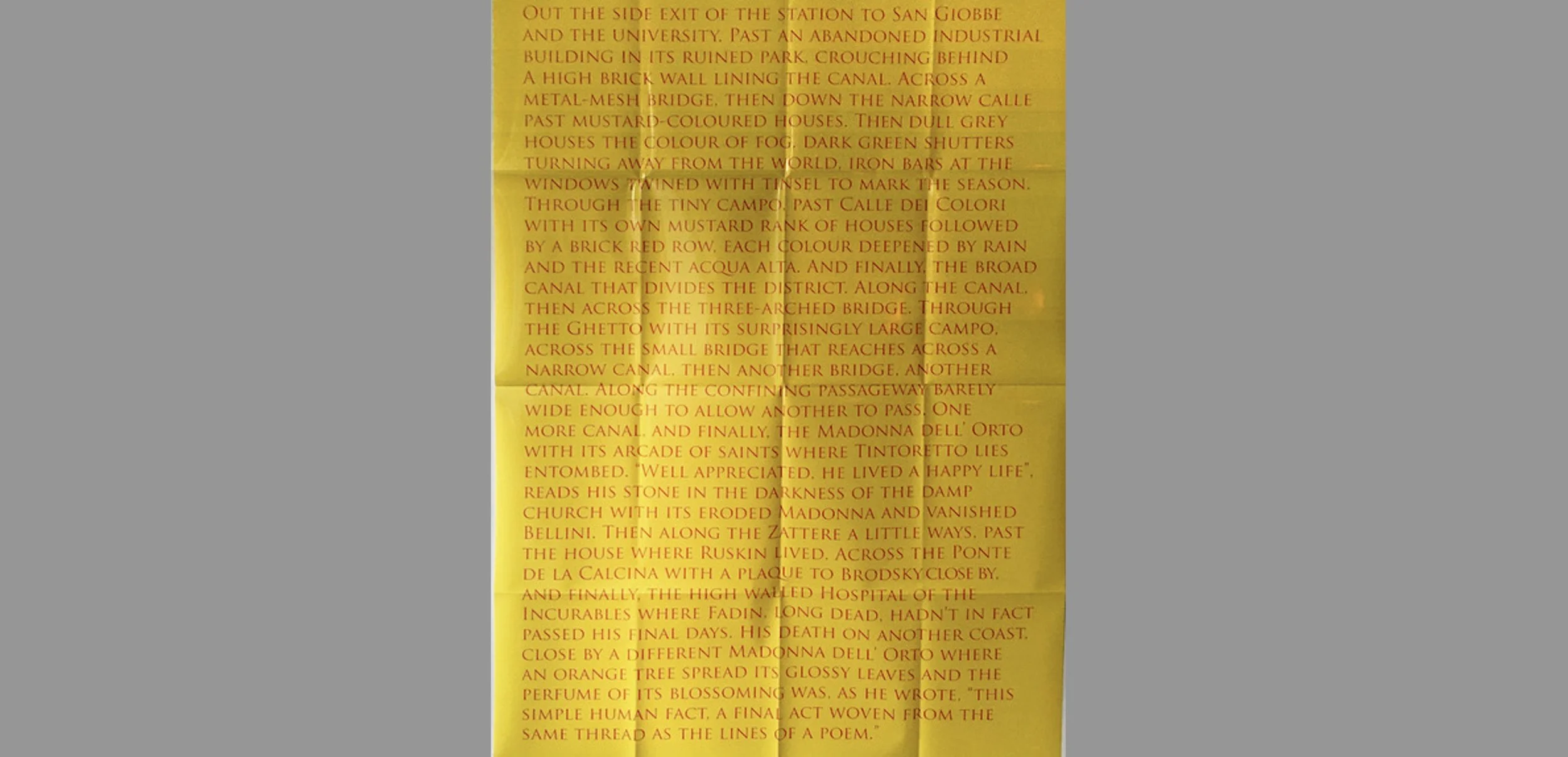
I’ve been deeply influenced by Eugenio Montale’s prose piece, “Visit to Fadin” which recounts the last time Montale saw the younger poet, Sergio Fadin, who was dying of tuberculosis. The poster describes the path Montale could have taken from the train station in Venice to the hospital near the church of the Madonna dell’Orto. In fact, the path described is impossible. It has glitch which would teleport you from one part of Venice to another. And in any case, Montale’s prose is misleading. Most readers would immediately think of the famous church in Venice. But the Madonna dell’Orto where Fadin lay dying was in Chiavari, on the other coast of Italy, south of Genoa.